Kate Watkins Printmaker Q&A
In Spring/Summer 2024 I was invited by curator Natasja Josza to have a solo exhibition of a selection of my prints at Courtx tennis club in Southsea Hampshire. Having not visited before I was really impressed by the welcoming light filled contemporary exhibition space and cafe which is accessible to members and non members and is right near the seafront. As part of the show they asked me to do a Q&A to give people a bit more insight into my creative printmaking practice. I’ve added the interview below for those who’d like to know more about my motivation and print background.


whO ARE YOU AND WHAT do you do?
I’m Kate Watkins an artist specialising in printmaking. My current body of work explores colour relationships and geometric forms alongside expressive abstract mark making
What’s your art background, how did you get into art?
I’ve loved art from an early age and was encouraged a lot by my mum who was really creative. I was an anxious teenager but art always made me feel calm and I focused on it more than my other subjects at A level. After studying Fine Art at Leeds University I knew I’d found the path I wanted to follow. I trained to be an art teacher afterwards and taught Photography and graphics in sixth form colleges in Hampshire for many years before changing to teach printmaking as a technical instructor at Solent University. I’ve always worked in education and more recently tried to focus more on prioritising my own practice alongside teaching. I also have a small art kits business called ‘love to print’ which I run in my spare time.
Where are you from and how does that affect your work
I’m originally from a small village in Hampshire between Winchester and Southampton. I returned to Hampshire after studying for my degree at Leeds and going on to do a PGCE at Reading University. I came back to the area for a great job teaching photography at Barton Peveril college. Later on during and after my MA in Printmaking at Winchester School of Art, I focused on work which was based on the Hampshire and Dorset coastlines so often travelled to different areas to gather source material such as Lepe Beach, calshot, hurst castle and mudeford.
Why do you do what you do?
The variety of techniques printmaking encompasses is so broad that there’s always more to learn and explore but it also means you can find ways to print with limited time, resources and space - it’s so versatile. I often think limitations make you more inventive as you have to find a way around the problems or adapt to find a way to create with what you have.
The desire to create, particularly with print sometimes feels like a compulsion for me. I always have ideas on the go, make rough sketches or plans or imagine future prints even if I know it’s unlikely I’ll get to do them, it’s tricky to switch off. I’ve used art in different forms as a way to express myself and explore ideas since my teens. When I started studying Art A level at Peter Symonds it was a real relevation to be encourage to push boundaries. The head of art Dave Thomas encouraged us to be as experimental and conceptual as possible and no ideas were off limits.
I planned to take a break from art when my children were small as I didn’t have time but I’m always drawn back to printmaking. I organised a solo exhibition while on maternity leave when my son was 12 weeks old thinking I’d be bored and have time on my hands - how wrong I was! I did the show but in hindsight I should have cancelled and avoided putting myself under so much pressure.
Who are your biggest artistic influences? What art do you most identify with?
My biggest print influences are the abstract expressionists particularly Robert Rauschenberg as well as a contemporary screenprinter called Kate Gibb. I was blown away by Rauschenbergs work when I first saw it in the 1990’s at a American Art exhibition at the Royal Academy in London. At the same exhibition I fell in love with work by Jasper Johns, Willem De Kooning and Helen Frankenthaler. Afterwards I found out about Rauschenbergs techniques like image transfer, screenprint and mixed media work as well.
Kate Gibb’s screenprins are also an inspiration. Her work is colourful and experimental and plays with scale and geometry alongside figurative subject matter. She’s been able to find a niche combining commercial projects with hands on printing techniques such as her fashion prints for Dries Van Noten or her Chemical Brothers album covers. I used her a lot as an influence in my A level graphics teaching.
What themes do you pursue?
I explored figurative and abstracted coastal themes for a long time leading up to my MA and afterwards and found some success with print sales of recognisable locations like Clevedon, Fawley and Brighton. However my Dad’s dementia diagnosis some years ago started me on a different path where I used geometric, abstract and architectural themes. I could no longer get out as often to gather new source material by the sea and felt I was trying to repeat images which had previously been popular but weren’t holding my interest so much.
My aim with the geometric prints was to create uplifting works of art with expressive colour relationships and the print process itself was a form of therapy for me. I was trying to create the visual concept of hope and protection as I had to leave my teaching job to help with my dad’s care and developing my own work was a way for me to hang on to my identity.
Tell me about your favourite medium & Where you find inspiration
It’s currently screenprint for the clean lines, ability to add multiple layers of colours and versatility of the process. I look at colour combinations in nature and found materials like rusted boats and weathered beach huts. I photograph close up’s as a reminder to come back to later. I have notebooks with lists of ideas in, many more than I can manage to actually produce. I’m also interested in pushing a particular technique like screenprint to make it behave in different ways for example I’m currently experimenting with screenprinting onto ceramics and wooden panels.
How does colour play a role in your artwork?
For a long time I worked with etching and photoetching which traditionally is quite monotone. I realised I needed to change technique and scale to really play with colour and explore abstraction more freely. As a result colour is really important to my work as it carries so many positive associations and you can change the mood or reaction to a piece by adjusting the colours to make it calming, energetic, harmonious or dissonant.
How do you work? What is the process of making your artwork?
I start with rough sketches and sometimes mock up a composition on photoshop before starting to make screens. The circular prints are made from handmade marks on drafting film using Indian ink. It’s a bit nerve racking starting to print as I usually only make one of each print so if I mess up a layer or mix the wrong colour part way through it can ruin the whole print.
When is your favourite time of day to create?
I’d say It’s whenever I can fit it in as life is very busy at the moment. I go through phases when I’m working on a few prints at a time and other times where I’m just creating examples for my teaching. I also run love to print an art kits small business on the side so during busy periods that takes up a lot of my time outside work. Sadly my mum now also has dementia so it’s a real juggling act fitting printmaking around commitments including my kids who sometimes I think would prefer a less creative parent! I’ve realised that I have to make time to create as it directly affects my wellbeing. I’m also a real night owl so often gather ideas and plan late at night.
What is your most important artist tool? Is there something you can’t live without in your studio?
Earl grey tea, notebooks and Colour swatches I’ve made from all the colours of screenprinting ink I have to help me pre-visualise compositions. My Solent University print colleague Katherine Anteney also made an amazing colour combination swatch book which I use often - pictured.
Is there a specific environment or material that's integral to your work?
Access to screenprinting equipment is a must and getting increasingly difficult to find. I used to go to the wonderful badger press which sadly shut down a couple of year ago. Also if budget allows somerset cotton printmaking paper is my must have item, it’s a beautiful paper that works with so many print processes and can take multiple layers of ink. Some of my prints have over 10 layers so it needs to be able to withstand this.
How has your style changed over time?
It used to be more figurative and based around actual locations and details as I used a lot of photography as a starting point. Now I rely more on imagination and intuition and a desire to push the print process itself. I also used to make editions of prints such as etchings but ended up focusing too much on whether they were all identical or if they sold. With one off pieces I feel more free to explore an idea and then I can move on to the next one.
What work do you most enjoying doing?
Test printing, playing and experimenting with ideas are much easier than committing to a final design. It’s like a holiday for the brain when you know you’re getting useful tasks done but don’t have to worry about every aspect. Happy accidents also come out of this stage that can change the direction of an idea. I teach printmaking at Solent University Printroom in Southampton so often make teaching resources which allows me to work through ideas e.g. recently I’ve been doing paper lithography (blog post available), aluminium etching and decolourant printing on fabric in preparation for workshops. I’ll be sharing these on my blog eventually too.
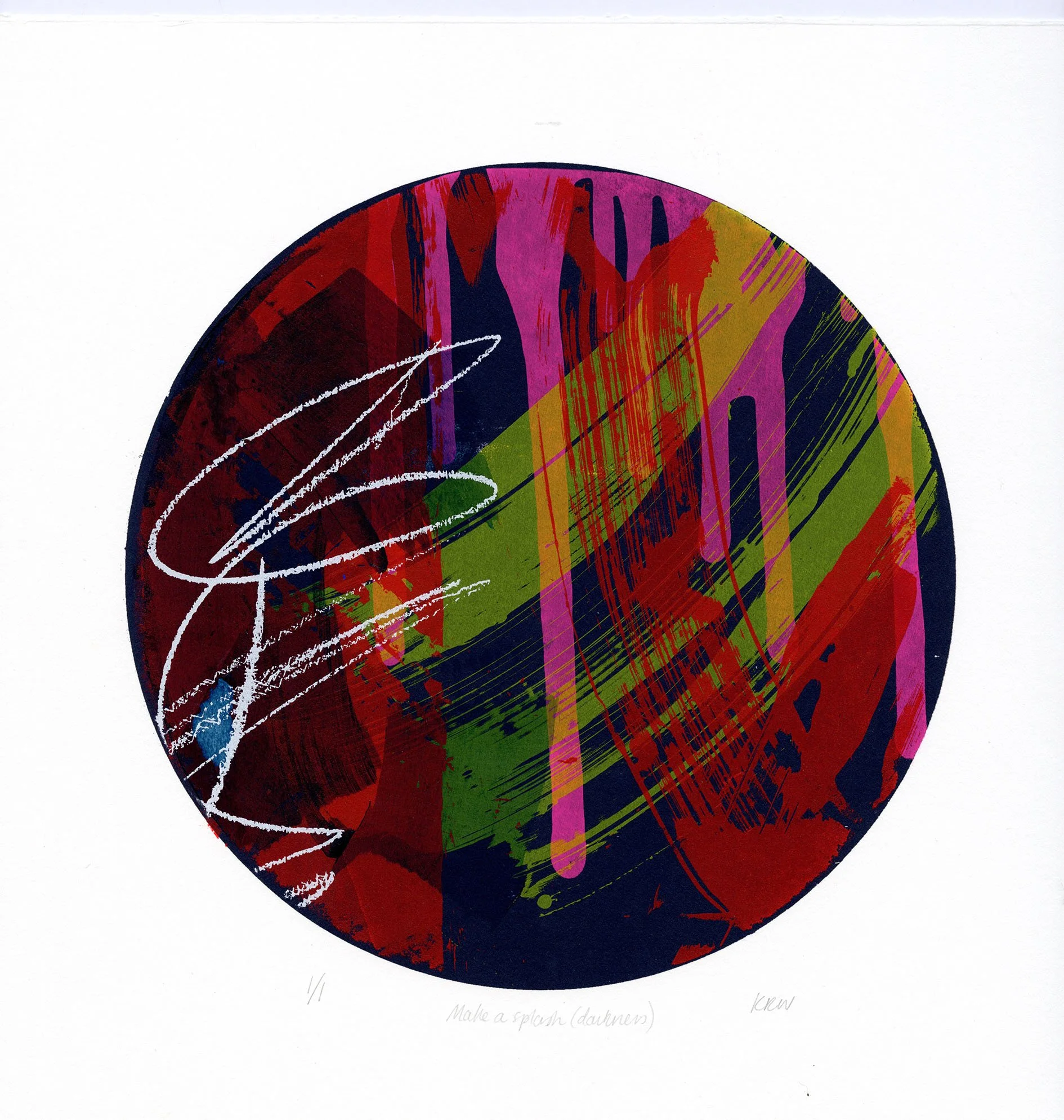
Tell me about this series of work & your favourite piece on display
This series of works has two parts, one is the geometric prints exploring colour relationships and shelter forms. The other are ‘pathways’ and ‘make a splash’ prints which are influenced by the abstract expressionists also about the joy of colour and escapism of expressive mark making and creating.
My favourite piece is probably ‘’make a splash darkness’ because of the colour interactions and brooding colour palette and I’ve recently turned it into a card and a glass coaster which is proving popular. I am also proud of Refracted Forms V which is the largest piece I’ve created and is a 1.1m x 60cm framed panoramic digital print from collaged screenprints mounted on aluminium. Technically it was difficult working this large but it’s given me lots of new ideas.